카테고리 없음
계산기 CSS 구현 ( flex 를 적극 활용해 보자 ! )
JJ_hyun
2022. 5. 5. 01:08
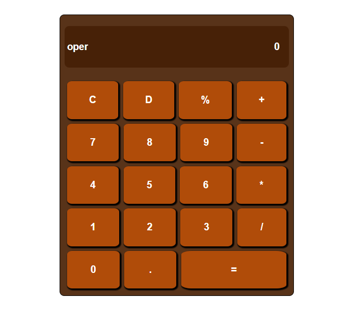
계산기 사진
HTML 코드
<article>
<section id="content1">
<input readonly type="text" id="operator" placeholder="oper">
<input readonly type="number" id="result_value" placeholder="0">
</section>
<section id="content2">
<section id="content2_row1" class="content2_flex">
<button type="button" class="btn_flex" id="btn_clear">C</button>
<button class="btn_flex" id="btn_delete">D</button>
<button class="btn_flex" id="btn_persent">%</button>
<button class="btn_flex" id="btn_plus">+</button>
</section>
<section id="content2_row2" class="content2_flex">
<button class="btn_flex" id="btn_7">7</button>
<button class="btn_flex" id="btn_8">8</button>
<button class="btn_flex" id="btn_9">9</button>
<button class="btn_flex" id="btn_minus">-</button>
</section>
<section id="content2_row3" class="content2_flex">
<button class="btn_flex" id="btn_4">4</button>
<button class="btn_flex" id="btn_5">5</button>
<button class="btn_flex" id="btn_6">6</button>
<button class="btn_flex" id="btn_multi">*</button>
</section>
<section id="content2_row4" class="content2_flex">
<button class="btn_flex" id="btn_1">1</button>
<button class="btn_flex" id="btn_2">2</button>
<button class="btn_flex" id="btn_3">3</button>
<button class="btn_flex" id="btn_devide">/</button>
</section>
<section id="content2_row5" class="content2_flex">
<button class="btn_flex_else1" id="btn_0">0</button>
<button class="btn_flex_else2" id="btn_dotted">.</button>
<button class="btn_flex_else3" id="btn_result">=</button>
</section>
</section>
</article>
CSS 코드
body{
margin: 0;
padding: 0;
box-sizing: border-box;
display: flex;
flex-direction:column;
align-items:center;
width: 100%;
height: 800px;
}
*{
box-sizing: border-box;
}
/* 계산기의 제일 큰 section */
article{
margin-top: 50px;
display: flex;
flex-direction: column;
width: 500px;
height: 600px;
border: 1px solid black;
background-color: rgb(88, 51, 25);
border-radius: 10px;
padding: 10px;
}
/* 부등호와 결과값을 나타내 주는 section */
#content1{
flex-grow: 1;
display: flex;
align-items: center;
flex-direction: space-between;
border-radius: 10px;
}
/* 버튼을 감싸는 큰 section */
#content2{
flex-grow: 3;
display: flex;
flex-direction: column;
align-items: center;
}
/* 부등호화 결과값의 태그인 input 을 꾸며주기 위한 코드 */
#content1 input{
font-size: 1.3rem;
font-weight: bold;
color: white;
background-color: rgba(68, 29, 3, 0.851);
margin-bottom: 10px;
}
input::placeholder{
color: white;
}
#content1 input:first-child{
width: 12%;
height: 70%;
border: none;
padding-left: 5px;
border-radius: 10px 0 0 10px;
}
#content1 input:last-child{
width: 100%;
height: 70%;
text-align: right;
border: none;
padding-right: 5px;
border-radius: 0 10px 10px 0;
}
/* content1 은 값과 부등호를 나타내는 자리. 작업완료 */
/* button 의 공통된 속성을 선언하는 코드 */
section button {
border: none;
font-weight: bold;
font-size: 1.3rem;
background-color: rgba(192, 80, 6, 0.897);
border-radius: 10%;
margin: 5px;
color: white;
box-shadow: 2px 2px 2px 2px black;
}
/* 버튼의 큰 섹션(이하 큰섹션) 의 자식요소들의 배치를 위한 코드 */
#content2 .content2_flex{
flex-grow: 1;
width: 100%;
display: flex;
flex-direction: row;
}
/* 1행의 4개의 버튼이 있는 경우 적용되는 코드 ( 1~4행 ) */
.btn_flex{
flex-grow: 1;
}
/* 5행의 버튼이 3개임으로 각각 class 값으로 비율을 맞춘 코드 */
.btn_flex_else3{
flex-grow: 2.15;
}
.btn_flex_else2{
flex-grow: 1;
}
.btn_flex_else1{
flex-grow: 0.95;
}
/* 버튼에 hover 기능을 추가해 시각적인 효과 추가 */
button:hover{
background-color: rgba(192, 80, 6, 0.1);
}
사실 더 추가한 부분이 있지만 현재 진행형임으로 좀 더 코드를 다듬고 디자인 요소를 추가 할 예정이다.
(5일 날 작업예정)
확실히 CSS 는 아름답고 재미있다. 결과물을 눈으로 확인 할 수 있고, 무엇보다 flex 를 써서 구현을 하니
생각보다 배치가 쉬워서 좋았다. 주로 flex-grow 를 사용했지만 수업을 들어보니 flex-basis 를
사용하는게 좀 더 쉽게 배치할 수 있겠다 생각이 들었다. 이 후 basis 속성도 연습해 봐야겠다.
줌으로 다른 교육생들의 결과물을 직접보니 대단하다는 생각이 들었다. 내가 좀만 더 노력했다면
구현 할 수 있겠는데? 생각이 들었던 코드들도 있었고 저건 시간이 좀 많이 걸리겠다 생각이 들었던
코드들도 있었다. 결론은 노력이 부족하다 ! 내일은 어제의 나보다 좀 더 노력해야지 !